How Fudo scaled faster with a brand-new design system
The challenge
Fudo offers SaaS tools to help restaurants and bars manage their operations. Once a small startup, they’ve grown into one of Latin America’s leading players. But as they scaled, their brand didn’t keep pace.
They had gone through a rebrand, but it never fully made its way into the product. The interface looked dated and disconnected from the brand customers recognised.
Designers and engineers also lacked clear standards for building new parts of the experience. Without a shared system, every update took longer and felt inconsistent. It was time for a change: a design system was the perfect way to bring order, speed and cohesion.
How we did it
-
01
We started by bringing the new brand into the product, aligning every touchpoint around a consistent visual language.
-
02
Then we built a design system from scratch, transforming the UI from an old Material Design style into something modern and refined.
-
03
Finally, we created documentation and usage guidelines so that both designers and engineers could ship better work, faster and with confidence.
All aboard
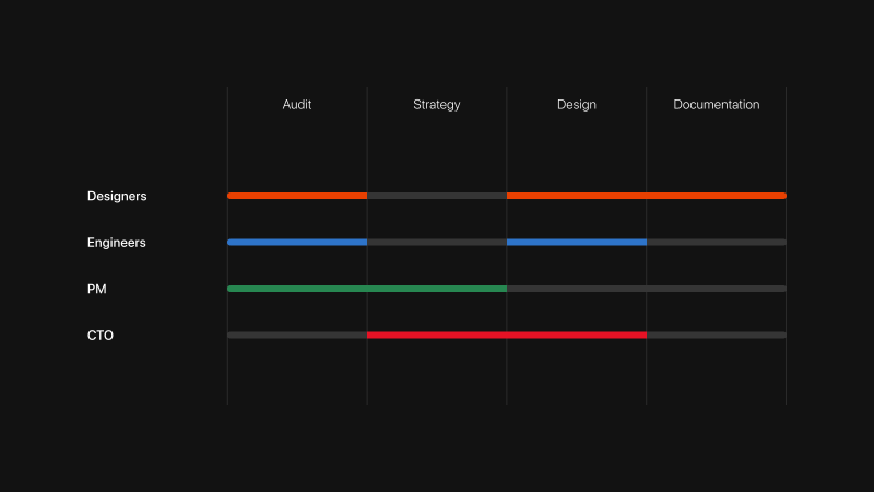
From day one, we involved the right people. Designers, engineers and product leads all had a seat at the table. This helped build trust in both the process and the outcome.
Together, we audited the existing experience, prioritised what to tackle first and defined a clear strategy. Our approach balanced collaboration with autonomy: Fudo’s team stayed closely involved, but we had the freedom to move fast and keep momentum.
Material Behind
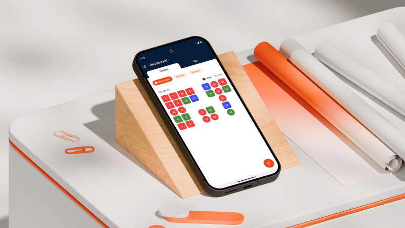
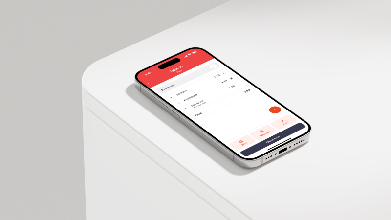
When we started the project, Fudo’s interface still looked like an old version of Material Design. One of the first challenges was translating that into a modern look and feel that reflected their updated brand.
We didn’t aim to redesign every screen at once. Instead, we used the new system to make high-impact improvements where they mattered most. This helped Fudo adopt the design system quickly, setting a solid foundation for future updates.
A scalable colour system
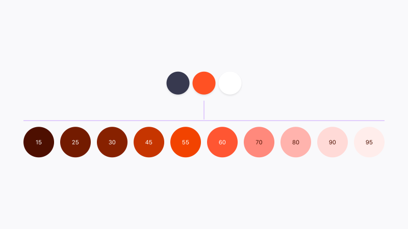
The brand palette we inherited was limited and not quite ready for use in a complex product. We expanded it into a flexible, scalable system built for real-world applications.
To make colours behave predictably, we based the palette on perceived luminance. This method creates logical, consistent results — more reliable than traditional approaches to product colour design.
The colour system was built to last: adding new colours or steps to the scale would be simple, keeping the design language adaptable as Fudo continues to grow.
Accessible from the get-go
Accessibility was a priority from the start. The original brand colours lacked enough contrast, so we created a colour matrix to test and visualise how different combinations performed.
The matrix made it easy to see which pairings met, exceeded or failed accessibility standards. Thanks to the structured colour logic, everything behaved consistently, no matter the hue.
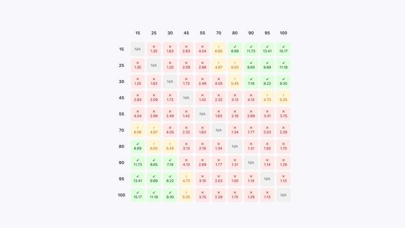
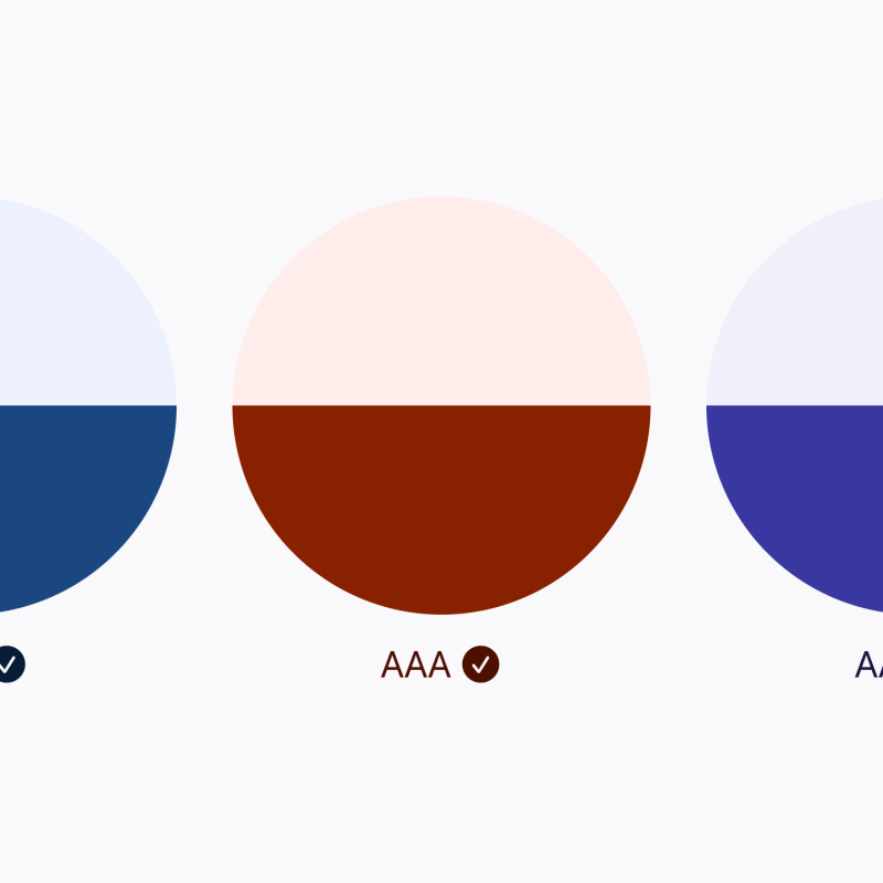
With this clarity, we could define which colour combinations worked best across the interface, guaranteeing readable, accessible contrast.
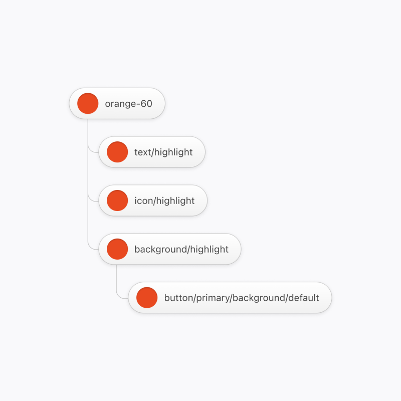
This thinking carried through into the token architecture: layers of semantic tokens built on top of the brand palette, helping designers and engineers choose colours that looked great and worked properly.
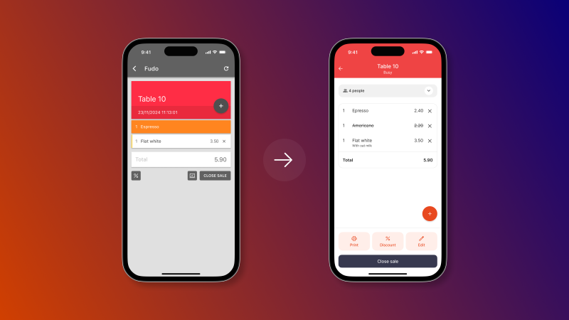
The art and craft of components
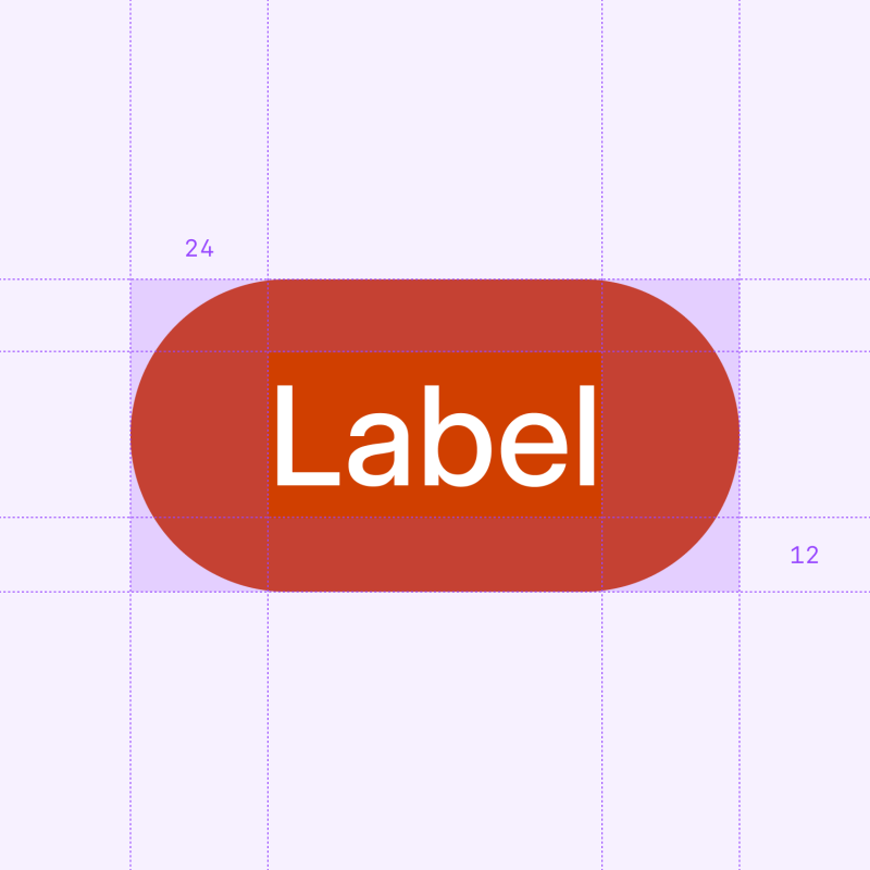
Colours and tokens were just the beginning. The real craft came in building the component library: a single source of truth that worked seamlessly across web and mobile.
We designed every component from scratch, following best practices to make them easy to use, maintain and scale. With Fudo’s team, we defined clear priorities, balancing scope and complexity for each piece. Once designs were finalised, we produced detailed specs for engineers, who had already been part of the journey from the start.
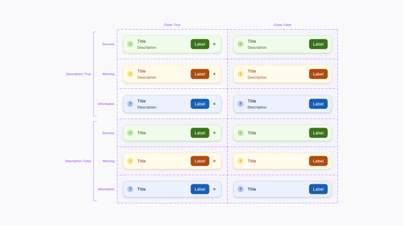
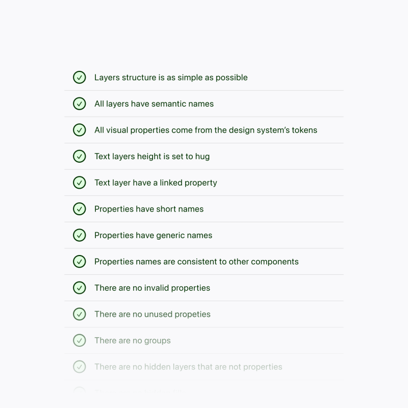
Each component went through a quality checklist: token usage, naming, structure and consistency were all reviewed carefully. The result was a refined, reliable library that was ready to power Fudo’s product experience.
Documentation for the win
Documentation often gets overlooked, but for us, it’s what turns a design system into something truly usable. From the start, we treated it as a key part of the process — not an afterthought.
We built clear, practical documentation that covered everything: from implementation details for engineers to usage guidance and examples for designers.
The impact was immediate: fewer bottlenecks, smoother handovers and greater confidence on both sides. Engineers didn’t have to wait for answers, and designers could trust that the final product would stay consistent.
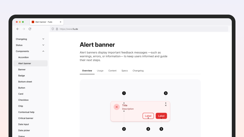
Meanwhile, the documentation site also became a kind of home for the system: A place where anyone at Fudo could explore, learn, and understand how to make the most of it. It helped new team members get up to speed quickly and built a sense of shared ownership across teams.
Fudo unleashead benefits with the new design system
-
01
A unified, branded experience across all products, creating a consistent and recognisable look and feel.
-
02
Faster decision-making and delivery, with designers and engineers working more efficiently and confidently.
-
03
A strong foundation for growth, giving Fudo a scalable system that will evolve alongside the company.